Kawn Point of Sale (POS) design system is a set of guidelines and resources to ensure consistent, cohesive, and user-friendly design across all Kawn POS products. The system provides a clear and accessible language to communicate design decisions, patterns, and best practices. It also serves as a foundation for scalability, flexibility, and maintainability of the design system.
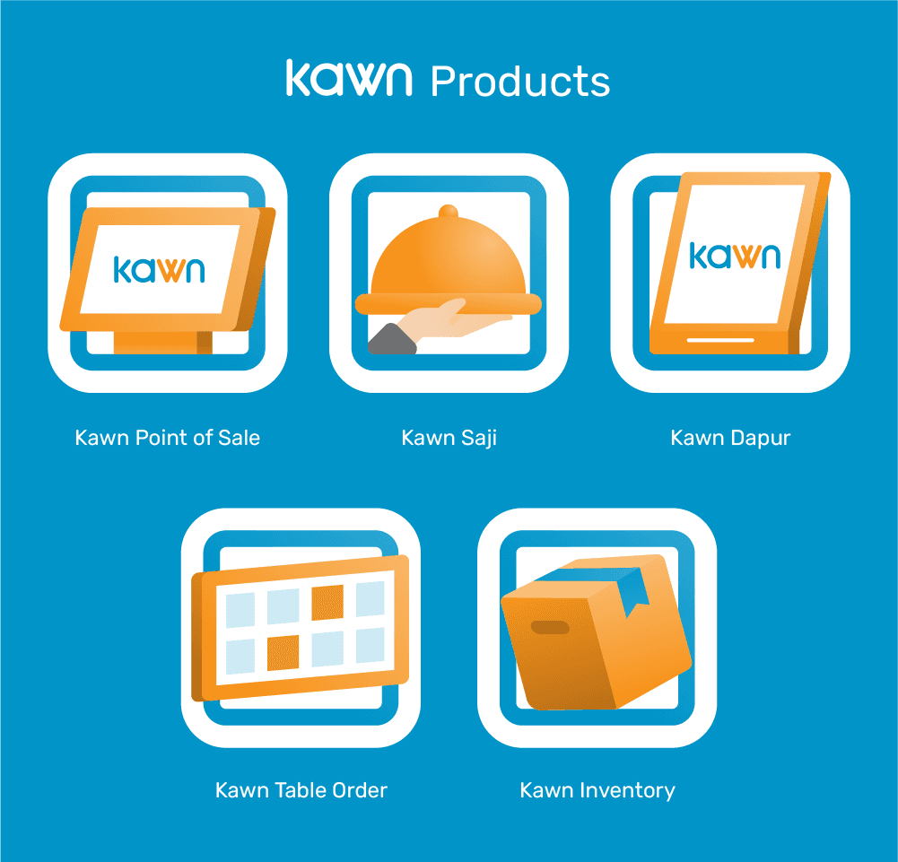
Kawn POS logo is a logotype in blue and orange color, with color and monochrome version, it makes the logo more adaptable and suit various designs. The product icons use illustration icon represent its function.
Page Titles - Heading 1
Page Titles - Heading 2
Page Titles - Heading 3
Subtitle
MIcrocopy
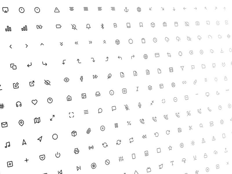
Kawn POS iconography uses simple, recognizable, and scalable icons to enhance usability and visual appeal. The system employs the feathericons library, it simply beautiful open source icons which provides a wide range of icons for different categories and use cases.
Illustrations can be used to showcase Kawn POS products and features in a more engaging way. For example, an illustration of a point of sale terminal with the Kawn POS interface displayed on it can help customers visualize the product.
The Kawn POS layout follows a grid-based system that ensures consistency, alignment, and balance. The system employs a 8px grid with a 4px baseline grid to ensure accurate spacing, proportions, and readability. The layout also follows the F-pattern, which prioritizes the most critical information in the top-left corner and guides the eye towards the main content.


